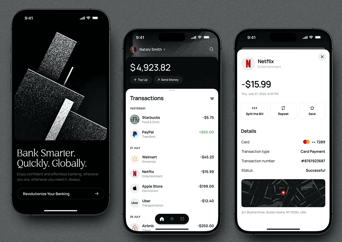
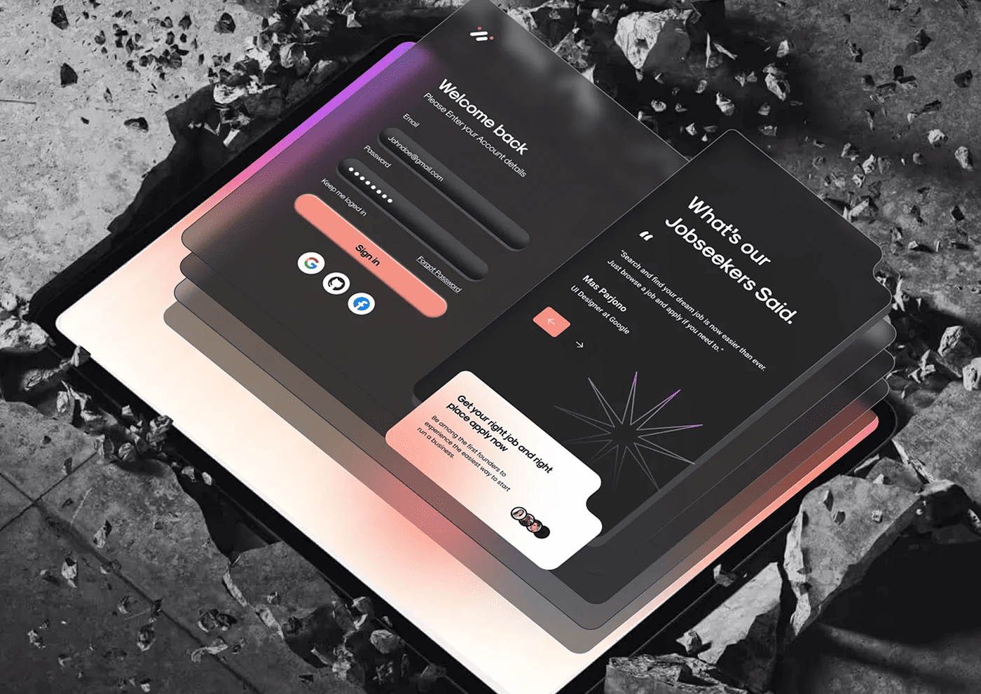
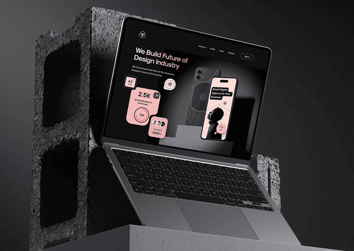
Color isn’t just decoration — it influences emotion, trust, and user behavior. Learn how to apply color psychology in your UI/UX projects to create interfaces that connect and convert.
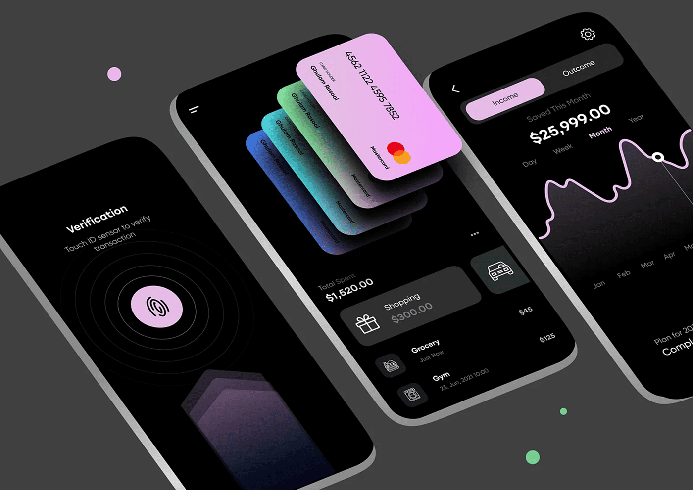
Color psychology plays a crucial role in UI/UX design by influencing how users perceive and interact with your product. Choosing the right color palette can evoke emotions, guide user behavior, and strengthen brand identity. Understanding the psychological effects of colors helps designers create interfaces that are not only visually appealing but also effective in communicating the intended message.
The Emotional Impact of Colors
Colors can trigger different emotions and associations. For example, blue often conveys trust and calmness, while red can evoke urgency or excitement. Knowing these emotional responses helps you select colors that align with your product’s goals and user expectations.
Balancing Aesthetics and Usability
A well-chosen color palette should not only look good but also enhance usability. Contrast is key to ensuring readability and accessibility. For example, using high contrast between text and background colors improves legibility for all users, including those with visual impairments.
“Colors are silent ambassadors of your brand, influencing user emotions and actions without a single word being spoken. Choosing the right palette is both an art and a science that drives user engagement.”
Creating Hierarchy and Focus
Use color strategically to create visual hierarchy and direct user attention. Highlight important buttons, alerts, or calls to action with accent colors, while keeping the rest of the interface neutral and unobtrusive.
Considering Cultural Differences
Be mindful that color meanings can vary across cultures. What signifies positivity in one culture may have a different connotation in another. Research your target audience’s cultural context to avoid misunderstandings.
Testing and Iteration
Finally, test your color choices with real users to gather feedback. Tools like A/B testing can reveal how different palettes affect user behavior and satisfaction, allowing you to refine your design for the best results.
Conclusion
Choosing the right color palette in UI/UX design is a powerful way to shape user experience and brand perception. By understanding color psychology, balancing aesthetics and functionality, and respecting cultural contexts, you can create designs that truly resonate with your audience.