

Designing for different screen sizes isn’t just about resizing — it’s about rethinking layout, interaction, and priorities. Discover how to craft experiences that feel native across both mobile and desktop devices.
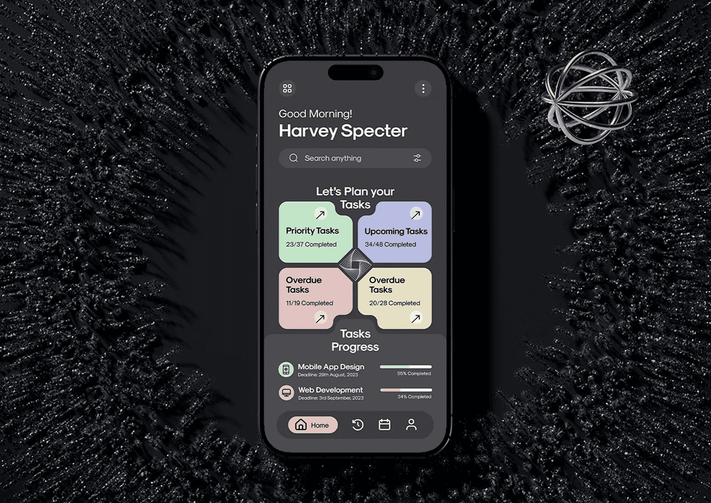
Designing for different screen sizes is one of the biggest challenges in modern UX/UI design. Mobile and desktop devices offer vastly different user contexts, screen real estate, and interaction patterns. To create effective experiences, designers must adapt their approach to meet the unique needs of each platform.
Understanding User Contexts
Mobile users are often on the go, seeking quick access to information or tasks, while desktop users typically have longer attention spans and more focus time. Recognizing these differences helps shape how content and features should be prioritized and presented.
Layout and Navigation Differences
Desktop designs can leverage larger screens to display more information at once, using multi-column layouts and complex navigation menus. On mobile, simplicity is key — navigation often shifts to hamburger menus or bottom tabs, and content is stacked vertically to fit smaller screens.
“Successful design adapts seamlessly to the device in hand, prioritizing usability and context. It’s not about shrinking or expanding the same layout, but about rethinking how users interact differently across screens to create intuitive and satisfying experiences.”
Touch vs. Click Interactions
Mobile users interact through touch gestures, requiring larger touch targets, more spacing, and consideration of finger reach zones. Desktop users rely on precise mouse clicks and keyboard input, allowing for smaller clickable elements and hover states.
Performance and Load Times
Mobile devices often operate on slower networks and have limited processing power, so optimizing load times and minimizing resource-heavy features is critical. Desktop environments can handle more complex animations and richer media but still benefit from efficient performance.
Designing for Responsiveness
Responsive design techniques enable layouts to adapt fluidly to varying screen sizes and orientations. Flexible grids, scalable images, and media queries allow a single design to serve multiple devices effectively.
Conclusion
Adapting designs for mobile and desktop isn’t just about resizing elements—it requires thoughtful consideration of user behavior, device capabilities, and context. By embracing these differences, designers can craft experiences that feel natural and effective on every screen.

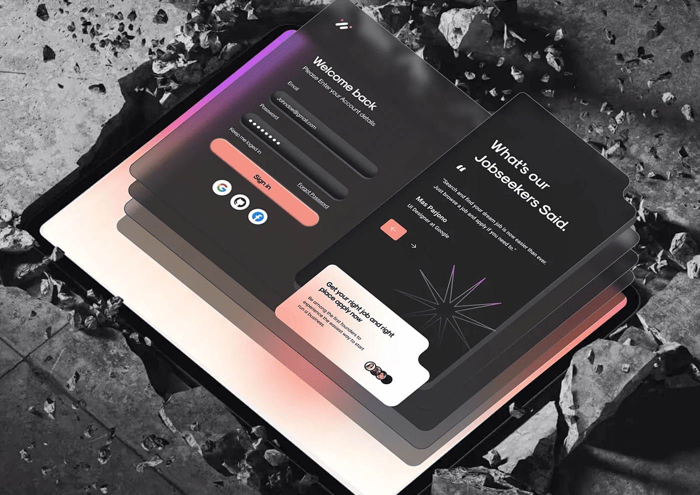
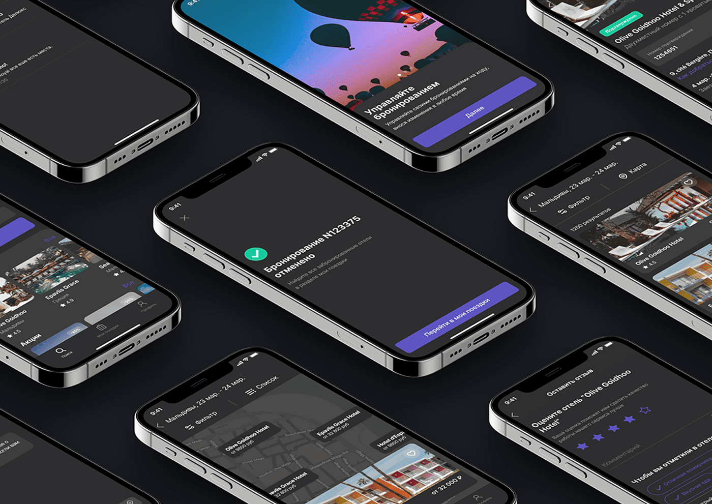
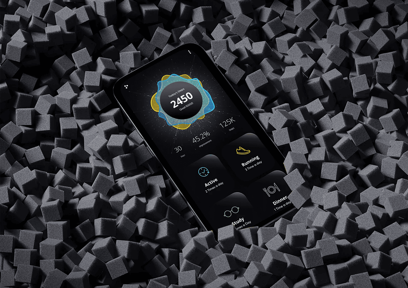

Insightful read! I appreciate how the article highlights the importance of responsive design rather than just shrinking desktop layouts for mobile. The comparison between user behaviors on each platform was especially helpful.
Great breakdown! It’s interesting to see how design priorities shift between mobile and desktop. Would love to see more examples of brands that successfully implement adaptive design across devices.