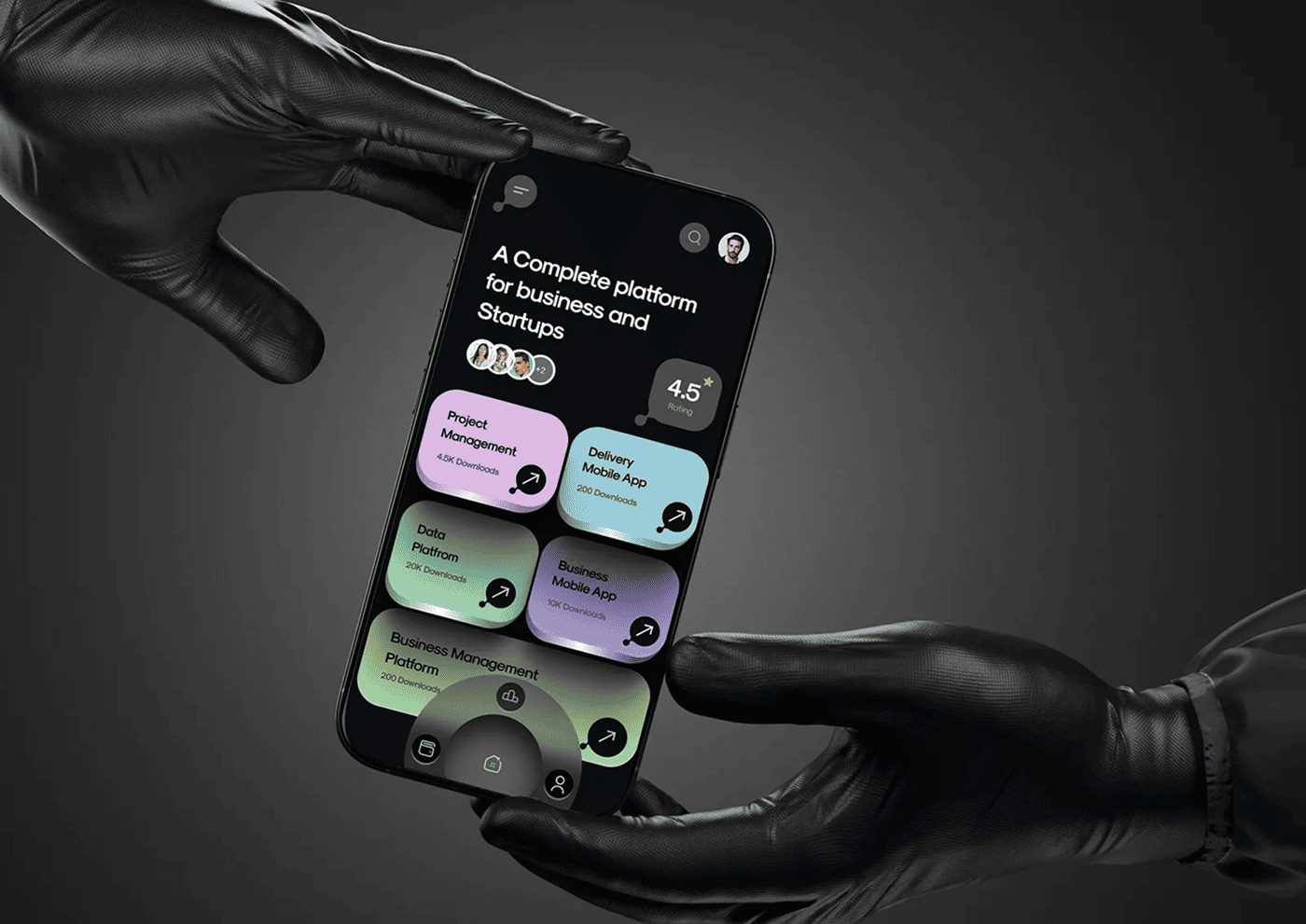
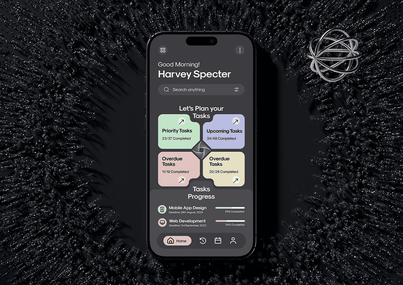
Dark mode isn’t just a trend — it’s a user expectation. Learn how to design dark UIs that are functional, accessible, and aesthetically pleasing across all screens and environments.
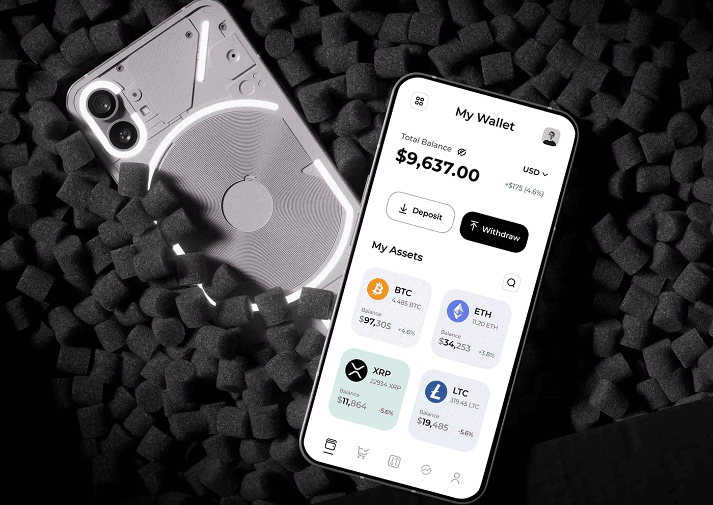
Dark mode has become a highly requested feature in many apps and websites. But simply inverting colors or switching to black backgrounds isn’t enough to create a truly effective dark mode UI. It requires thoughtful design to ensure readability, accessibility, and user comfort.
Understanding Dark Mode Benefits
Dark mode can reduce eye strain in low-light environments, save battery life on OLED screens, and offer a stylish alternative to traditional light themes. However, it must be designed carefully to maintain clarity and visual hierarchy.
Choosing the Right Colors
Pure black backgrounds can cause harsh contrast with white text, making it uncomfortable to read. Instead, use dark grays with subtle color variations to soften the interface. Accent colors should be vibrant but not overpowering, maintaining legibility.
“Dark mode isn’t just about making things darker; it’s about creating a balanced visual experience that reduces glare and improves focus. When designed right, it can transform an app into a comfortable, elegant space that users want to spend time in, especially during nighttime or extended use.”
Maintaining Accessibility
Ensure sufficient contrast ratios between text and backgrounds to meet accessibility standards. Avoid relying solely on color to convey meaning, and test with users who have visual impairments to create an inclusive design.
Designing for Context Switching
Users may switch between light and dark modes frequently. Maintain consistency in layout and interaction patterns so users don’t feel lost. Consider animations or smooth transitions to make the switch less jarring.
Testing and Iteration
Test your dark mode on multiple devices and lighting conditions. Gather user feedback to identify pain points, such as readability issues or color fatigue. Iterate based on real-world usage to refine the experience.
Conclusion
Creating a dark mode UI that actually works goes beyond flipping colors—it’s about enhancing usability, comfort, and aesthetics. By focusing on color choice, accessibility, and user context, you can build a dark mode experience that feels natural, reduces eye strain, and delights your users.